Here is the link to my all pdf files.
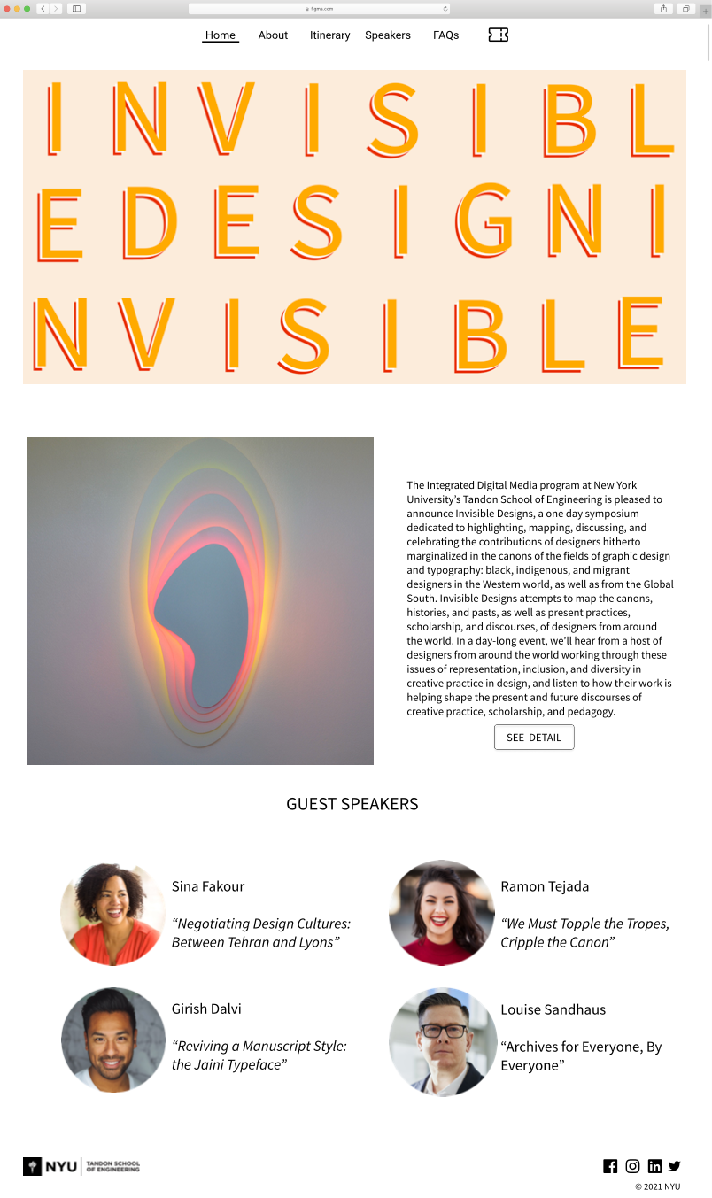
This week we need to complete the final work of the design system — a poster, an article spread, and a website design for a one-day seminar on “Invisible Design” at New York University.
In the past three weeks, I have changed the design of these three parts many times. This assignment's process let me know how difficult it is to be a designer to change the details of the design. Moreover, every small change can bring new vision and feelings to the audience. I’m very grateful to the teachers and classmates who provided me with help and ideas in this homework, I don’t have any experience with using the Adobe suite and graphic design. This processing allowed me to learn a lot of new knowledge. I really appreciated it.
First of all, I want to show the final work of my poster. As you can see, the style of the poster does not seem to change much from the first draft. But I made some small changes, which made the entire poster a very helpful improvement. For example, I replaced cartoon fonts with modern fonts, which made the style of the poster more serious. In addition, I added two different shadow colors behind each letter to make it more three-dimensional. The most significant change is that I replaced the two original grids on the frame with four grids, which made the poster look more concise. Finally, I think the most effective change is that I no longer use a single black and white as the main color, but try a different color palette. The yellow, white, and orange colors make the overall poster more vivid, and also make the main content highlighted in the frame more obvious.


Next, I want to share the difference between the first draft and the final draft of my article spread. It can be seen clearly from the picture that the background of the spread is more concise than the previous design. Also, I only used the poster background on the first page of the layout, instead of adding this element to every page like the first draft. In last week’s class, I got a lot of feedback from my classmates:
- change the size of the title “invisible” a bit smaller
- adjust the leading between the title with the beginning of the first column
- take out the NYU logo
- make all images width the same
The professor suggested that I add a white background to the pictures on the third and last pages. At the same time, I should also pay attention to text alignment and hyphenation. After I got this feedback, I made a lot of changes to the article spread. I hope the final visual design can make my audience more convenient and clear to read.


Last, what I want to share is my website design. In the past three weeks, I have made many different styles of websites. Some of them are not related to the theme of the whole design, so I changed them many times. Here is the vision of my website in the first two weeks:


After I got a lot of feedback from my friends, I focused on making this design that related to my poster and the article spread. I used the same color pattern and the background of the poster as the homepage of the website. The professor told me what he thought of my new vision:
- A nice visual for a header, but it needs something more functionally
- Need to find a better picture to replace the picture on the second page, because the original vision isn’t very appealing.
- Separate the paragraph into two, and trying use weight, color, etc.
- Change the leading between the speaker’s name and their presentation title.
- On the speaker’s page, it should highlight the header.
- No clear visual delineation of this footer region.
Finally, I made a 12-grid website. After I modified the website, it looked more professional than before. To be honest, the whole process of designing these things is more difficult than I thought. As a designer, in addition to keeping everything clean for your audience, you also need to have your own style and organization. A little change can bring new feelings to users.


